How To Choose What Goes on a Gallery Wall
I could probably write a novel-length love letter to gallery walls because let’s face it - they are kind of the blue jeans of home decor.
Kate here, and today I’m sharing my process of putting together a gallery wall that just works. You might remember from my post about decor dos and donts from all my old apartments that I’ve been a big fan of the gallery wall since day one, but admittedly I think I’ve gotten a lot better over the years at figuring out the formula that makes a great one.
Here are the main 4 rules I stick to:
1. Don’t be afraid to mix up frame sizes, colors, and shapes
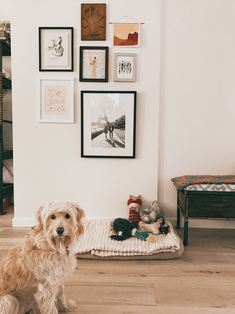
I was on the fence about whether or not this gallery should have frames that are all the same color, because there’s kind of already a lot going on in this room (as there tends to be in spaces I occupy, lol). But ultimately, I thought it would just be a lot more fun to mix and match.
The best thing about this approach is that it’s not supposed to look perfect or uniform, so you give yourself some wiggle room to play around and feel it out.
The other great thing about working in several different frame colors and shapes is that it can really help to tie a room together that otherwise might feel disjointed. Right now our main living area (which is one long, open plan room) has been feeling this way, because our furniture is kind of an eclectic mix that doesn’t necessarily adhere to one style, color palette or era.
Finding artwork and frames that pick up some of the different colors that pop up in this big, long room is REALLY helping to pull together some things that I wasn’t sure could be pulled together and it’s making me so happy.
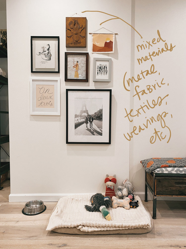
2. Try working in texture and mixed materials like fabric, textiles, or even metal!
While I always love a good grid-style gallery wall where all the frames are the same size and it’s all very uniform, I get much more excited about the idea of mixing up a hodge podge of random stuff I’ve collected over the years.
If you have a few pieces on hand that are a little out of the ordinary or made of a different material, see if you can work them into your design! I LOVE bringing texture into wall decor as often as possible, and this 3D metal beetle that we bought 10 years ago in Rome made such a cool addition to this gallery. I love that it adds some dimension and breaks up the group of regular frames.
The fabric painting is by an artist I love named Ana DiGiallonardo, and I totally love how the little dowel rod and stitching she did over it change up the visual story here too.
3. Mix black & white photos and art with more colorful pieces
I love to break up a group of colorful art with more neutral black and white pieces peppered in, because it lets your eye rest a little bit and provides some contrast.
The big Paris photo served as the jumping off point for this gallery wall, and since I knew that was going to be the largest piece in the collection I wanted to echo it with a couple of other black and white pieces throughout to balance it. The skull print is from a favorite Nashville vintage shop, and the fish illustration is from a cool little art shop in Barcelona.
4. Choose pieces with coordinating colors that show up in more than one place
Depending on how colorful you like to keep things, you can either go for the full spectrum and feature every color of the rainbow or keep it to a limited palette. I tend to err on the side of maximalism and anything goes, but for this wall I wanted to keep it somewhat subtle and stick with shades of earthy terracottas, ochre and desert-y pinks and blues.
I’ve found that it’s nice when you can place two pieces that feature the same color on opposite sides of the ‘gallery’ - the way the ‘un deux trois’ print and the fabric painting above both echo each others’ desert peachy pink. It helps to balance out the composition and leads your eye around the whole group of pieces.
So those are my quick tips for a great gallery wall recipe! Nola’s bed has been just chilling by this awkward wall and I felt like she needed some artwork to vibe out the space a bit more. She wasn’t crazy about the hammering but now that it’s done I think she seems pretty satisfied.
What are your favorite ways to mix up your wall decor and display photos and art??


